Allessandra Home Care in Lancaster, California is committed to helping seniors stay safe and independent at home. Color contrast in bathroom design is a simple, practical way to reduce fall risk, improve navigation, and support daily routines. This article offers evidence-based strategies tailored for aging eyes and changing vision, with clear steps you can take in a single bathroom or across a small home.
Why does color contrast matter for seniors?
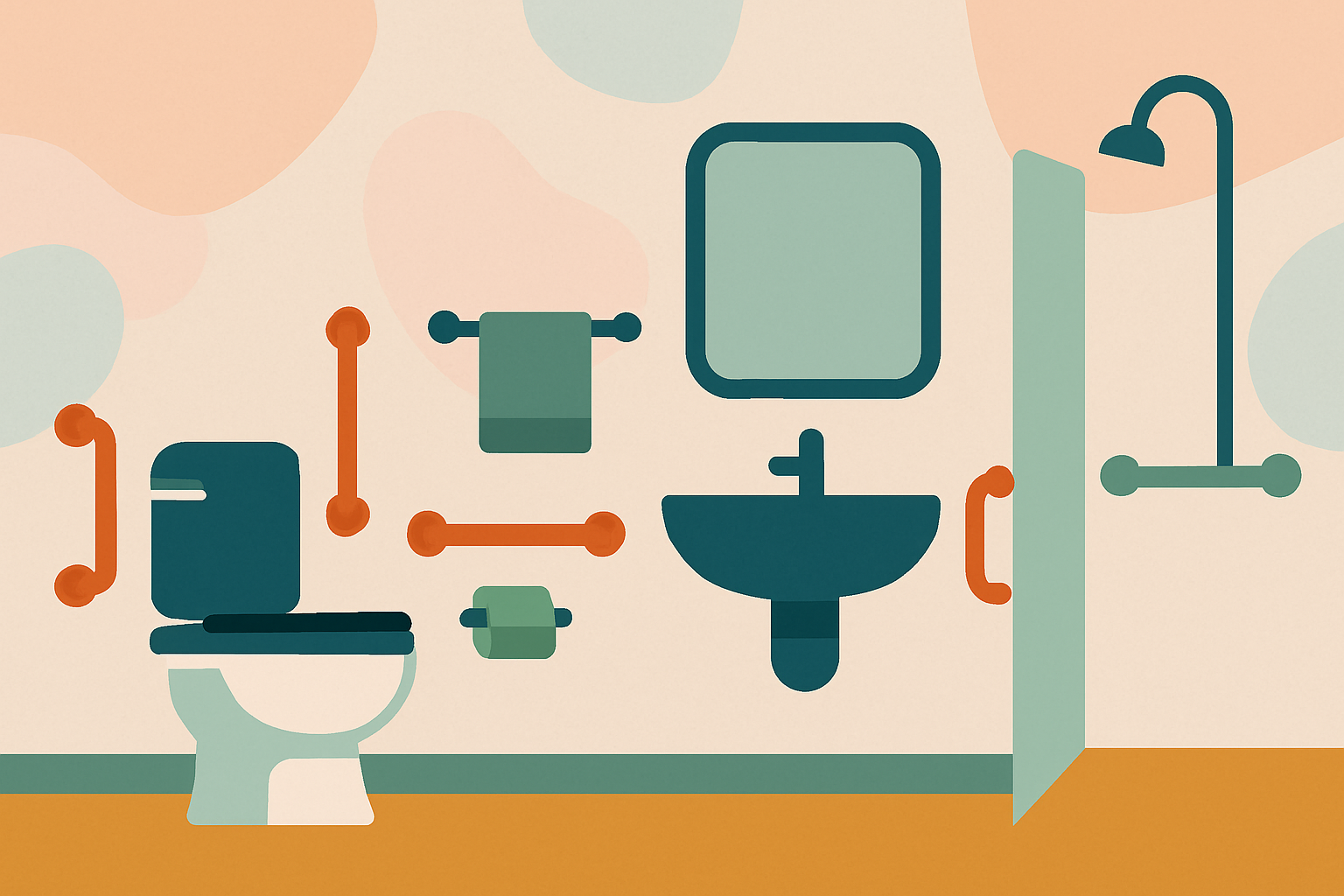
As we age, the eyes undergo changes that can affect how we see depth, edges, and textures. Pupil size decreases, lighting sensitivity increases, and conditions such as cataracts or macular degeneration can blur details. In a bathroom, where tiles, fixtures, and surfaces meet and water can create glare, a lack of contrast makes it easy to miss steps, locate grab bars, or distinguish a toilet from the floor. Implementing thoughtful contrast helps seniors:
- Locate fixtures quickly without squinting or searching.
- Identify the edges of steps, thresholds, tubs, and shower entrances.
- Differentiate between surfaces that look similar in dim light.
- Reduce hesitation and uncertainty that can lead to slips.
A well-contrasted bathroom supports independence while giving caregivers peace of mind. It’s a practical and economical approach that can be layered onto existing safety measures such as grab bars, non-slip mats, and well‑lit spaces.
What color schemes work best in bathrooms for aging eyes?
Choosing colors with high legibility and clear separation between elements is key. Some general guidelines:
- Aim for high contrast between fixtures and floors. A light wall and dark floor is easier to read at a glance than a pale wall on a pale floor.
- Use warm, non-glare lighting (around 2700–3000 Kelvin) to complement color choices and reduce harsh shadows.
- Prefer matte or semi-matte finishes on walls and fixtures to minimize glare while maintaining color visibility.
- Avoid busy patterns on floors or walls that can create visual noise or camouflage edges.
- Consider accessibility tests such as the “two-foot rule”: can you distinguish a fixture from its background from about two feet away?
Practical palette ideas include: a charcoal or slate floor with white or off-white walls; a medium-neutral wall color with a darker tile at the floor line; and bright-edged accents on grab bars or thresholds to provide focal points without overpowering the space.
Practical color-contrast tweaks you can implement today
- Increase floor-to-wall contrast by selecting flooring that is noticeably darker than the walls and ceiling. For example, a charcoal or deep gray tile paired with warm cream walls.
- Make the toilet stand out by choosing a seat color that contrasts with the bowl (e.g., a light seat on a white or very light-colored toilet) or vice versa.
- Add contrast to grab bars and rails by choosing a color different from the surrounding wall. A blue or green bar on a pale wall is easier to spot than a white bar on white.
- Select a shower seat, shower door frame, or niche edging in a hue that contrasts with the adjacent surfaces to help visibility when transferring or sitting.
- Place a bath mat or non-slip rug that contrasts with the floor color, and ensure it has a non-slip backing to reduce shifting.
- Use edge cues on thresholds, steps, and cabinet doors-think bright-painted thresholds or color-coded tape that’s secure and water-resistant.
- Mark faucet handles, cabinet knobs, and switches with a slightly contrasting color or frosted finish to aid tactile and visual recognition.
- Favor matte finishes for walls and trim to minimize glare from overhead lighting, which can obscure edges in wet spaces.
- If possible, test color choices in natural daylight and at typical bathroom lighting levels to confirm visibility across the day.
Note: If you rent or share a bathroom, discuss feasible, non-permanent changes (such as color-coordinated accessories, removable decals, or high-contrast mats) that do not damage surfaces or violate lease terms.
Quick reference: color contrast pairings for bathroom safety
| Area | Suggested Contrast | Example colors | Why it helps |
|---|---|---|---|
| Floor vs walls | High contrast (floor dark, walls light, or vice versa) | Charcoal floor with warm ivory walls | Helps the eye pick up boundaries quickly, reducing missteps. |
| Toilet vs floor | High contrast between toilet and floor | White toilet on a dark slate floor | Locating the toilet easily prevents missteps and awkward pivots. |
| Sink/vanity vs wall | Medium to high contrast | Light cream vanity against a soft gray wall | Improves edge definition for reaching sinks without searching. |
| Grab bars vs wall | Distinct color or shade from surrounding wall | Navy grab bars on pale beige wall | Grab bars are quickly visible for safe gripping in transfers. |
| Shower seat/threshold | Contrasting color from adjacent surfaces | White bench with a dark tile surround | Aids smooth transfers and reduces slipping risk when entering/exiting the shower. |
| Mat and rug vs floor | Contrasting color with non-slip texture | Bright blue mat on a dark floor | Visual cue to the mat location plus traction reduces slips. |
This table is a practical starting point for planning small bathroom upgrades or guiding conversations with a home care professional. It emphasizes visibility and quick recognition of key hazards or supports.
How can you test your bathroom’s contrast today?
- Do a quick walk-through at different times of day and with lights at different intensities to observe how well edges, thresholds, and fixtures stand out.
- Solicit simple feedback from the senior resident or caregiver: can you spot the grab bar without looking away from the sink? Is the toilet easy to locate from the shower?
- Create a temporary mock-up using painter’s tape or removable decals to simulate color changes and observe comfort and visibility before committing to permanent alterations.
- Consider professional evaluation from an occupational therapist or a senior-safety specialist who can tailor color contrasts to specific vision changes or medical conditions.
Implementing your color-contrast plan: a simple 5-step checklist
- Assess the current bathroom layout and lighting: identify areas where glare or dim corners reduce visibility.
- Choose a high-contrast palette for critical zones: floor-to-wall, toilet, grab bars, and shower edges.
- Source safe, non-slip accessories and fixtures in the chosen palette: mats, seat, towel bars, and shelves.
- Apply changes in stages if needed: start with the area most prone to slips (the shower/threshold) and then address the toilet and vanity.
- Reassess and adjust: after installation, observe how the senior uses the space during typical routines, and refine color choices or placements as needed.
This step-by-step approach helps ensure that changes are practical, durable, and aligned with daily routines. It also provides a framework for caregivers and family members in Lancaster, California, to collaborate with clinicians or home-modification specialists.
Frequently asked questions
- Could changing colors interfere with interior design aesthetics? Not necessarily. Subtle, high-contrast accents can be integrated into a design scheme without compromising style.
- Are there color considerations for individuals with cataracts or other eye conditions? Yes. In such cases, warm, softer contrasts may be easier to process than stark, icy contrasts; consult with an eye care professional for personalized recommendations.
- How much modification is needed to improve safety? Even small changes can yield meaningful improvements. Start with the most-used areas (toilet, shower, sink) and expand gradually.
Conclusion
Safe bathrooms don’t have to be clinical or sterile. They can be welcoming spaces that prioritize visibility and independence for seniors. By applying thoughtful color contrast-supported by good lighting, slip-resistant surfaces, and strong supportive hardware-Allessandra Home Care in Lancaster, CA helps residents maintain dignity and control in daily routines. If you’d like a personalized assessment or help choosing color palettes and fixtures, our team is ready to assist with practical, budget-friendly solutions tailored to your home.